QualityGraph — cross-repository QA intelligence for engineering teams
The problem QualityGraph solves
You have Codecov for coverage numbers. You have GitHub for PRs and CI. You might have SonarQube for static analysis.
But none of them answer the question an engineering leader or QA lead actually needs answered:
Across all our repositories — where are we healthy, where are we deteriorating, what test layer is missing, which flaky tests are wasting the most CI money, and which PR that's open right now is the riskiest?
Codecov tells you coverage went down. It doesn't tell you which test layer is missing, how much CI time your flaky tests are burning, or whether the auth-service PR that just landed has contract test coverage.
QualityGraph is the intelligence layer that sits above your existing tools and gives you the full picture.
What it does
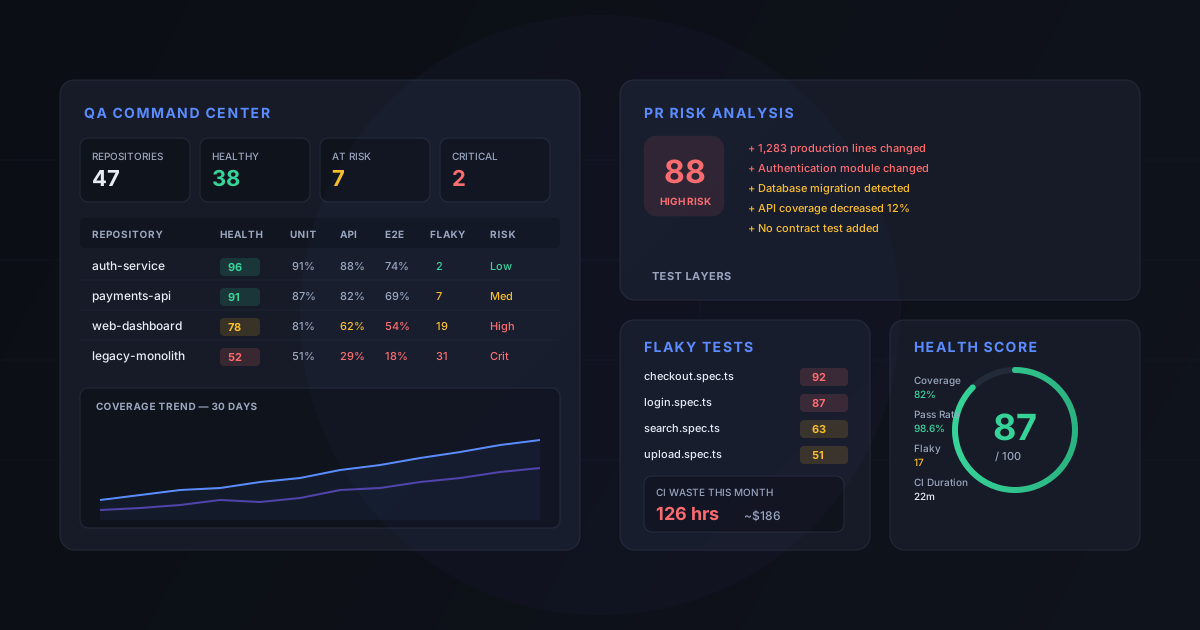
QualityGraph connects to your GitHub organization and Codecov instance, ingests data from your CI pipeline, and builds a unified QA intelligence dashboard. Here is what you see when you open it.
Organization QA Command Center
The homepage shows every repository at a glance — health score, coverage by test type, flaky test count, and risk level. Color-coded so you can scan 50 repos in seconds:
- Green — healthy, no action needed
- Yellow — needs attention, coverage or flakiness trending the wrong way
- Red — critical, significant gaps or high-risk open PRs
KPI cards across the top: total repositories, healthy count, at-risk count, critical count, overall coverage, changed-code coverage, pass rate, flaky test count, CI waste, and open high-risk PRs.
Unified QA Health Score
Every repository gets a normalized 0-100 health score that combines:
- Overall coverage (10%)
- Changed-code coverage (20%)
- Unit, API, UI, and contract coverage (10% each)
- Test pass rate (10%)
- Flaky test health (10%)
- Critical failure count (5%)
- Pipeline efficiency (5%)
The weights are configurable per organization, with per-repository overrides. The score is deterministic — same inputs always produce the same number. And it comes with reasons: "Lost 8 points because API coverage is 62%, below the 70% threshold."
Rating bands make it scannable: Excellent (90-100), Healthy (80-89), Needs Attention (70-79), At Risk (50-69), Critical (0-49).
Coverage by test type
This is where QualityGraph diverges from plain coverage tools. Instead of one coverage number, you see coverage broken down by test layer:
- Unit tests
- API / integration tests
- UI / E2E tests (Playwright, Cypress)
- Contract tests (Pact)
A repository with 85% overall coverage but 0% contract coverage has a very different risk profile than one with 70% overall but balanced layers. QualityGraph makes that visible.
Cross-repository coverage gap matrix
For the QA lead managing 20+ repos: a matrix view showing every repository against every test type. Instantly spot which projects lack API coverage, which have no E2E tests, and which ones have full-stack coverage.
PR risk scoring
Every pull request gets a 0-100 risk score based on:
- Lines and files changed
- Critical modules touched (auth, payments, migrations)
- Database migration detected
- API contract changes
- Coverage delta
- Missing test layers for changed code
- Flaky tests encountered
- Historical defect-prone files
Risk bands: Low (0-29), Medium (30-59), High (60-79), Critical (80-100). Each score comes with human-readable reasons: "Authentication module changed, database migration detected, API coverage decreased 12%, no contract test added."
Changed without tests detection
For every PR, QualityGraph analyzes the diff against coverage data and detects:
- API endpoints changed with no API-level test coverage
- React components changed with no UI test coverage
- Contract interfaces changed with no contract test
- Production code changed with no test coverage at all
Each finding has a severity (HIGH, MEDIUM, LOW) and a description specific enough to act on.
Flaky test severity scoring
Not all flaky tests are equal. QualityGraph scores each one on a 0-100 impact scale based on:
- Failure rate and retry rate
- CI time wasted
- Number of affected branches and PRs
- Whether it blocks merges
- Whether it's in a critical test suite
- How recently it failed
The team stops chasing every intermittent failure and focuses on the one that's blocking 12 PRs and burning 40 CI hours per month.
CI waste calculation
How much money and engineering time are flaky tests actually costing?
QualityGraph tracks retry executions, failed pipeline runs, wasted runtime, and estimates both CI cost and developer delay. A typical output:
- Test executions: 183,220
- Retry executions: 7,834
- Flaky failures: 2,119
- Wasted CI runtime: 126 hours
- Estimated CI cost: $186
- Estimated developer delay: 312 hours
The developer-delay number is clearly labeled as an estimate. The assumptions (average engineers waiting per blocked pipeline, hourly engineering cost, runner cost per minute) are configurable.
Test-to-code mapping
Which tests cover which production code? QualityGraph builds mappings from coverage instrumentation, file naming conventions, Codecov flag associations, and import analysis. Each mapping has a confidence level: exact, strong, probable, or unknown.
This answers questions like: "If I change src/payments/checkout.ts, which tests should I run?" and "Is this test suite covering anything unique, or is it redundant with the unit tests?"
Unique coverage contribution
For each test type, QualityGraph calculates:
- Raw coverage (what this type covers)
- Unique lines (covered only by this type)
- Shared lines (also covered by other types)
- Overlap percentage
If your E2E suite covers 60% but only 3% of that is unique — the rest is also covered by unit and API tests — that's expensive redundancy. Conversely, if contract tests contribute 15% unique coverage, that's 15% of your code that would be uncovered without them.
Historical trends and regression detection
QualityGraph stores daily snapshots and surfaces trends over 7 days, 30 days, 90 days, 6 months, and 1 year. When a metric drops meaningfully, it generates a regression alert:
- "API coverage dropped from 74% to 61% in 14 days"
- "Flaky-test impact increased 42%"
- "Average pipeline duration increased 29%"
Quality gates
Configurable quality gates that evaluate every PR:
- Changed-code coverage minimum (default: 85%)
- Overall coverage maximum decrease (default: 1%)
- Critical risk blocks merge
- Contract changes require contract coverage
- Flaky test impact maximum (default: 90)
GitHub PR Check integration
QualityGraph posts a Check Run on every PR with a QA summary: health score, PR risk, changed-code coverage, test layer status, findings, and flaky test warnings. The check links back to the full dashboard for drill-down.
How it's built
QualityGraph is a production-grade platform, not a prototype:
- Backend: NestJS, TypeScript, Prisma, PostgreSQL — 18 modules, 238 tests passing
- Frontend: Next.js 14, React 18, TanStack Query, Recharts, Tailwind CSS — 15 routes, dark ops-dashboard theme
- Integrations: GitHub API (repos, PRs, commits, workflows, Check Runs), Codecov API, webhook-driven ingestion
- Parsers: LCOV, Cobertura, JaCoCo, JUnit XML, Playwright JSON, Pact
All scoring algorithms (health score, risk score, flake impact, CI waste, unique coverage) are pure functions — deterministic, testable, with extensive edge-case coverage.
The database schema is designed for scale: 100+ repositories, millions of coverage-line records, thousands of PRs per month. Aggregation happens at the database level, not in application memory.
The demo flow
Here's what a team sees when they first connect QualityGraph to their GitHub organization:
- Connect GitHub — install the GitHub App, select repositories
- Sync — QualityGraph pulls repos, branches, PRs, commits, and coverage from Codecov
- Command Center — the dashboard lights up with health scores, coverage matrices, and risk levels across all projects
- Drill down — click any repository to see its full QA profile: coverage by type, trends, flaky tests, CI waste, test mappings
- PR flow — open a PR, QualityGraph posts a Check Run with risk score, test gaps, and quality gate results
- Act — the regression alerts and recommendations tell you exactly where to focus: "Fix checkout.spec.ts (impact 92)", "Add API tests for billing-service", "Add contract tests to payment-service"
Who it's for
QualityGraph is built for:
- Engineering leaders who need to answer "how healthy is our testing?" across 10-100 repositories without opening Codecov 47 times
- QA leads who need to prioritize which test gaps to close, which flaky tests to fix, and which repositories need attention
- Platform teams who want to enforce quality gates on PRs without blocking velocity
- Teams with mixed test stacks — unit, API, E2E, contract — who need to understand coverage by layer, not just one rolled-up number
If you've ever had a production incident that would have been caught by a contract test nobody wrote, or a flaky E2E suite that wastes 100+ CI hours per month that nobody quantified — QualityGraph is the dashboard that makes those gaps visible before they cost you.
Get started
QualityGraph is available as part of our Integrate and Harden engagement. We deploy it into your environment, connect it to your GitHub and Codecov, and you watch the dashboard light up with your real data.
Want to see it on your repos? Book a pilot.